WM Primitives · the grid
Twenty-four columns, three-pixel lines
One margin, one gutter and one set of columns for every WORDMARK page, and a baseline cut from the leading the way 12/15 type sits on a 3pt grid. Turn on the columns (G) and the lines (L), then flip the body leading (B) to see why 24.8 cannot stay.
13 | skip | 10. The hero is calsans's: thirteen columns of lede, one empty column, ten of notes. The empty column and two gutters make the 77px gap the page had chosen by eye (72).
grid-column: 15 / span 10
The columns
10 | 14 — calsans's 5:7 split · cards inset one column + one gutter (rule A)
Cal.com
The card sits on the grid. Its text starts one column and one gutter in, so it lands on the next column line, not on a padding that happened to look right.
Geometry
Fourteen columns. On a phone both cards take all twelve, and the inset stays one column + one gutter: 30px at 390.
8 · 8 · 8 — thirds · 4 · 4 · 4 below 1024
eight
eight
eight
6 · 6 · 6 · 6 — quarters, which 30 columns could not do · 6 · 6 below 1024
six
six
six
six
The lines
display · fluid · round(nearest, 1.1em, 3px)
Hamburgefonstiv, at every width
title · 26 / 30 · 10 lines
The leading, subdivided
lede · 18 / 27 · 9 lines
Every role's leading is a whole number of three-pixel units, so baselines of different sizes still meet on one set of lines.
body · 16 / 24 · 8 lines
Body copy is where the grid is decided. At 24 every line of a long paragraph lands on a strong line. At 24.8 the first line does, and each line after it falls another 0.8px behind, until by the tenth it sits between lines. Flip the body chips with the lines on and watch this paragraph walk off the grid while the lede above and the interface type below stay put.
ui · 12 / 15 · 5 lines
Twelve on fifteen: the print grid this one is modelled on. Labels, captions, the dial's words.
micro · 9 / 12 · 4 lines
axis tags · metric rules · annotations
Breakers and screenshots
A breaker. .wm-break takes its box to the window's edges and pads the margin back in, so its words sit where the page's do. A tool has no margin at all (.wm-grid--bleed): its text keeps one gutter from the window instead.
A .wm-cols inside a breaker lands on the page's own columns.
This half ends on the right margin, as the page's would.
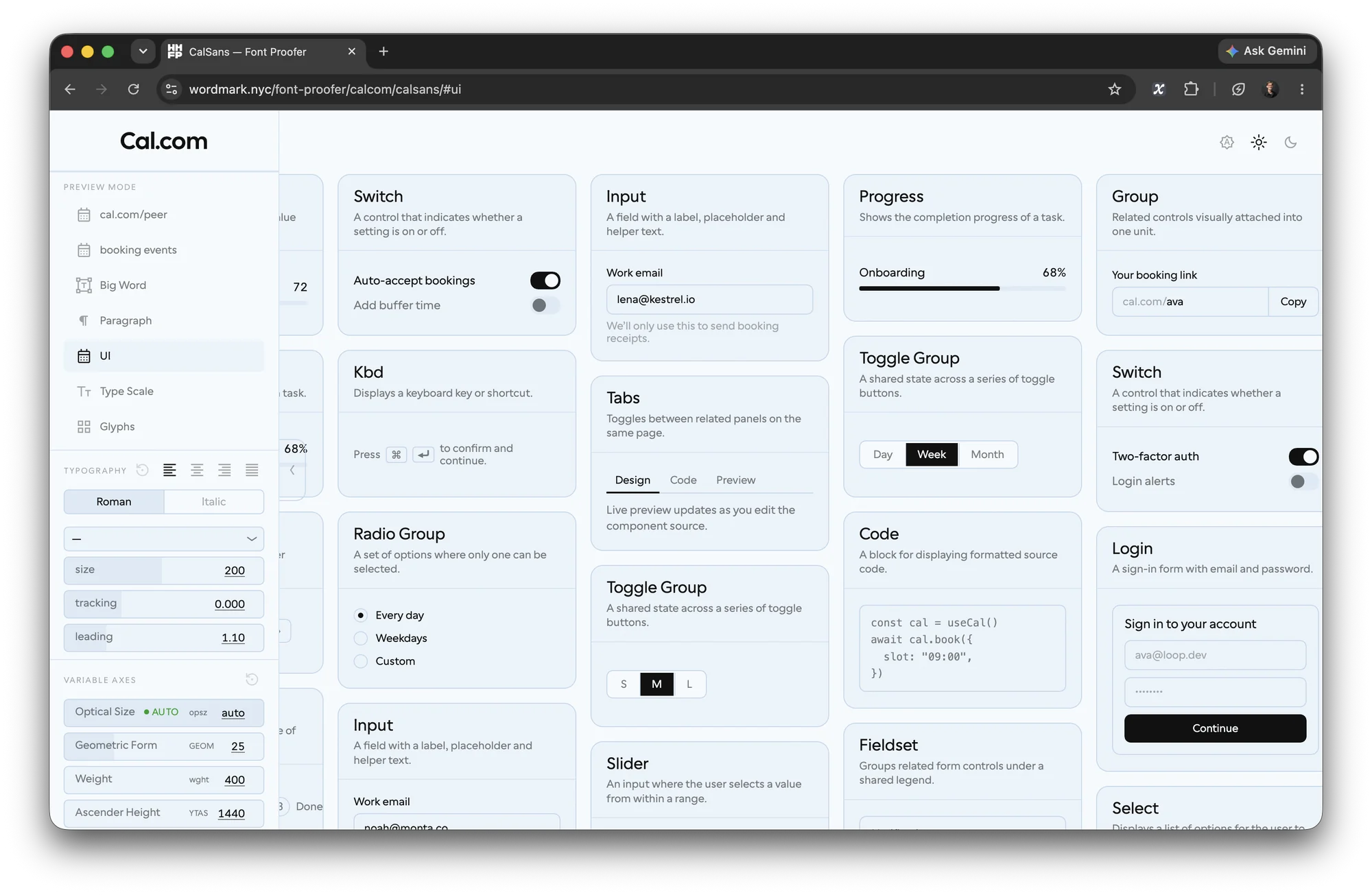
A macOS window screenshot keeps its shadow as a transparent margin, so the window sits inside the image. Flagged data-shot="mac", the shadow is cut out of the layout and the window's edges sit on columns 11 and 24 (turn the columns on: G).
The numbers
| token | desktop | below 1024 | below 600 |
|---|---|---|---|
--grid-cols | 24 | 12 | 12 |
--grid-gutter | 24px | 24px | 12px |
--grid-margin | 7vw | 7vw | 20px |
--bl | 3px | 3px | 3px |
| card inset | one column + one gutter | ||
What is on the lines, and what is not. Text and the space between text blocks are in units of 3px. A chip's padding, a button's, a card's top and bottom, stay on the pad scale (4 6 8 12 16 24 32 48 64) — components keep their own spacing; the column of text keeps the rhythm.